Friday, May 17, 2013
He's all yours
Ironman! We were suppose to do this light thing so that the person wearing the mask looked like ironman. Reduced shutter speed and all that. In the end it didnt work too well. we forgot the light in the middle of his chest (the whole ironman trademark) and the redness of his mask doesnt show up well in the light. Also the beam of light that glows on his hand resembles a phone too much instead of his pulse laser thing. But the red hightlights in the background and how nice the glow behind his eyes are came out in the end pretty well.

happy little tree

Painting was super fun. I definetly looked forward to this part of the class the most and it was fun to mess with paint. I started out the first whole week trying to paint clouds but I couldn't get it the way I wanted to. I tried doing what Bob Ross did but everytime I stroked outwards it looked horrible so I just dabbed with the fat brush. The mountains took forever to paint (I used like 5 layers) but I wanted it to be kind of like a dark background looming over the rest of the painting. I scrapped that idea and painted it green in the end.

I added another mountain to the left and tried to make it bright with alot of trees on the side of it. The little landing on the right was the edge of a cliff or field that overlooks a river thing. I started a nice tree that would have covered the mountain a bit but I couldn't decide what kind of tree it would be. I still want to work on it if I get more time.
Friday, April 26, 2013
Algernon

Monday, April 22, 2013
Aching for Clay
Using the ipads to draw up some designs on the free art app was pretty tech savvy in my opinion. After messing around with the app for the first 30 minutes, I figured out the basics of the app. Even though, I dislike the ipad and how inconvenient it is to make things with the clay model. I'd prefer actual clay but the ipad app was less messy and yay technology right.
Once I had the clay infront of me I fiddled around with it and a turtle came to shape. I don't really see the point of planning and design. I liked my turtle. The head was the hardest part so Brandon had to help me with it.
 |
| Look at those sharp edges. I am so good with touchpad technology. |
 |
| Mr. turtle why is your shell so good? |
Zen

 Our next project was to make zentangles, which are pictures made of
lines and patterns that all come together into one big peice. It's
suppose to be creative and induce your imagination and be pretty but
that doesnt come naturally. We first had to start on a block of sidewalk
to see how it would look. To the left is what happened when we used colorful mud to paint. I liked this overall one alot better than our big zentangle on the brick walls of the courtyard.
Our next project was to make zentangles, which are pictures made of
lines and patterns that all come together into one big peice. It's
suppose to be creative and induce your imagination and be pretty but
that doesnt come naturally. We first had to start on a block of sidewalk
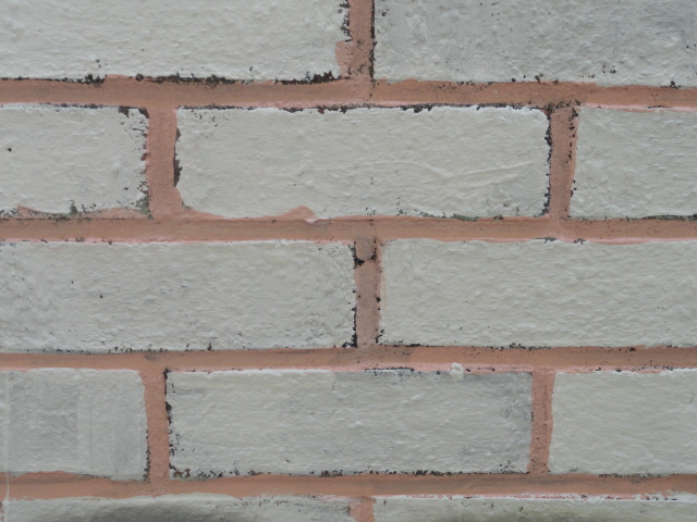
to see how it would look. To the left is what happened when we used colorful mud to paint. I liked this overall one alot better than our big zentangle on the brick walls of the courtyard.In the courtyard, we decided to do a reverse brick wall where the bricks would be colored white and the filler concrete in between would be red. It took us 3 days and the hardest part was keeping our mud from dripping down into the different colors.

The end product of one of the better parts of the wall where didnt mess up. Overall I liked doing the hands on part of the project alot and wouldn't mind doing something like this again.
Forced Perspective Photography

Tuesday, March 26, 2013
Pancakes!
This is from the photoshop tutorial on pancakes and mouths. I used different pictures of pancakes and a fish and a shark instead of the pictures Mr. Sands used mainly because it was easier to google them instead of actually finding the real pictures.
 This is the first one i did. Clearly, the merging didnt go well and adobe kept crashing so i had to use gimp which i havent gotten around to messing with too much. I got bored and messed with the different presets in gimp brushes and made the shoop da woop thing below.


reflection eternal

__________________________________________________________

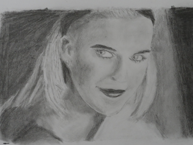
Out of all my art projects, the value scale portrait was the one that I learned the most from. Learning about all the shading and different shadows that show on a persons face was interesting and fun. After completing the value scale project I learned that I should be less afraid of the dark and focus more on highlights of the lips, eyes, and hair rather than the shadows. Highlights bring the picture to life.
paper jam
I liked this project alot. Although putting the image onto the piece of rubber was kinda annoying it was fun carving out my praying mantis. I liked the way it turned out overall. I tried messing around with the main colors brown and green to try and get the setting right. The one on the left I tried giving the tree a specific brown color and the mantis a nice green turquiose color along with the leaves.


The print on the right happened after I did the second print over my first one. Although the blue doesnt really go with the brown and green colors, I liked the highlights of the blue on the mantis. If I could do this all over again, I'd probably do the hippo instead. I love hippos and they're my favorite animal anyways.
Tuesday, March 12, 2013
sprayyyyyyy
I enjoyed this project entirely. It was fun to do all parts of the projects. From tracing the outlines of the different stencils to actually stencilling my face and making the frame. Doing hands on work is definitely more fun than bookwork.

Initially I misaligned my stencils while tracing and the black parts were off a bit from the blue. This shows up clearly on my final product. It kind of looks cool though so I dont mind. Messing with the spraypaint was the best part and I liked the different textures that arose from the uneven spraying of different colors.
Zombies: Beware!


Wednesday, February 20, 2013

Value Scale
Shadows

Thursday, February 7, 2013
EVERYBODY RUN

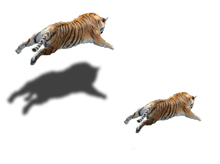
Flying tiger
Monday, February 4, 2013
racing the rhino

mr. salmonella

The skin of the turtle looked really run to draw with all the wrinkly lines and textures.
Drawing the specific parts of the shell was hard and the overall dark color of the turtle shell proved hard to apply on paper. I don't know how to shade very well but overall I think the turtle came out pretty well. Next time I would probably focus more on the details of the head and the parts of the turtles body that stuck out of the shell.
Friday, January 25, 2013
asdfsdfasdfasdfas


Subscribe to:
Posts (Atom)